Nicer charts
Wouter had blogged about his charts based on Takuo's per-maintainer statistics from the Debian BTS.In an effort of true R evangelism, I bugged Wouter about the gnuplot ugliness in those charts and offered an R script as an alternate. Per his reply, he seemed please with the output [1] -- click on the png for a nicer pdf:
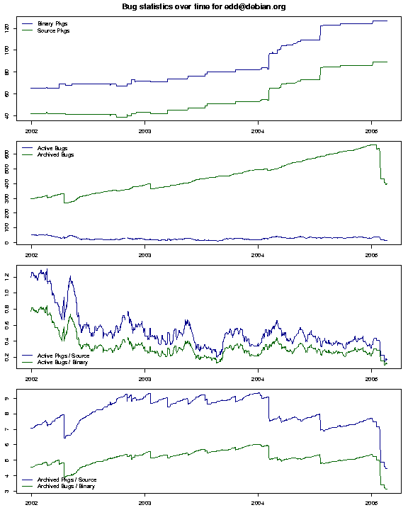
For anybody interested, the
R code is available. It provides two simple functions. The first actually
creates the 4x1 chart. The second loops over all datafiles ending in
.csv in a given directory, assuming the filename before the
.csv ending provides the unique identifier (here the maintainer
name and email as per Takuo's and Wouter's setup). On a per file basis, data
is loaded, and a pdf and png are produced. This can be called as in
R CMD BATCH debian_bts_chart.Rwhich will create
R CMD BATCH debian_bts_chart.Rout in the current
directory.
Lastly, I should note that I do think that the underlying data is wrongly classified. Counting a bug as 'active' even when it has been closed, but is not yet archived merely because the 28 days period hasn't passed is plain wrong. In my book, a closed bug cannot count as an active one.
[1] This is my own data, and it shows the drop-off a few weeks ago when I passed maintainership of a good dozen packages on to others.