Improving simple charts
Earlier today and via Planet Debian, Lucas blogged about the 'age distribution' of Debian packages, defined as the time since the last (re-)compilation. He illustrated his findings with an, umm, rather ugly chart. Having climbed onto the soap box once before, I would like to point out how easy it can be to create simple, informative, and, at to least to me, prettier charts using R.Lucas included a URL to the data. The first nice thing to note that we can read the data directly from the URL -- no need to copy the file:
pkgAge <- read.table(file="http://people.debian.org/~lucas/arch-age/arch-age.log", col.names=c("pkg","yyyymmdd"))
read the data into a data.frame which we have given two column names.
pkgAge[,"date"] <- as.Date(as.character(pkgAge[,"yyyymmdd"]), "%Y%m%d")
pkgAge[,"age"] <- as.numeric(difftime(Sys.Date(), pkgAge[,"date"], units="day"))
pkgAge[,"prop"] <- (1:nrow(pkgAge)) / nrow(pkgAge) * 100
We then create three new columns. First is a date, by parsing the (integer) dates (after first casting them into characters) by supplying the format in standard C notation:
"%Y%m%d" for year, date and month without
any separators or formatters. Now, having the date as an actual date
object inside a real data analysis language we can do
things as e.g. computing date differences. The difftime function
does just that, using the current date as other point. We ask for the return
to be in days, and cast this down to a purely numeric vector (instead of
datediff object). Lastly, we quickly compute the date proportion in
percentages.
We can then view the date. Before we plot,
png("packageAges.png", quality=100, width=640, height=480, pointsize=10)
oldpar <- par(mfrow=c(2,2), mar=c(2.5,2.5,3,1))
we direct the charts to a png file of given dimensions, and ask for all
plots in one figure (using mfrow with two rows by two) with
somewhat smaller figure margins using the mar argument to par.
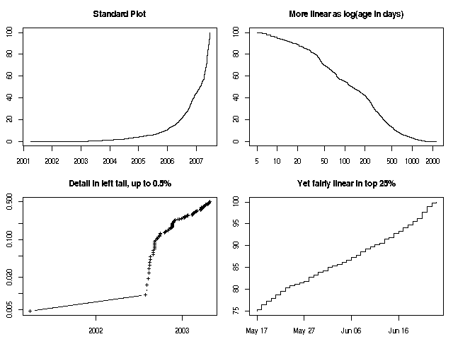
The first chart shows again proportion over date:
with(pkgAge, plot(date, prop, type='l', main="Standard Plot"))(The with() function simply allows us to refer to the columns by their names without explicit subsetting.
plot(pkgAge[,"date",],
pkgAge[,"prop"])
is equivalent, but more cumbersome.)
As it clear that the data has a fairly long tail in the older dates, we can also try to plot the plot over logarithmic time differences. This doesn't work for dates, but it works for our (positive-valued) age variable:
with(pkgAge, plot(age, prop, type='l', log="x", main="More linear as log(age in days)"))
The very far left tail below 0.5 percent is interesting as the one very old package is clearly an outlier within an outlier region. We use the subset function to take just one portion of the data, use logs, and explicit plotting symbols '+' in a points-and-lines plot:
with(subset(pkgAge, prop<0.5), plot(date, prop, type='b', log="y", pch="+", main="Detail in left tail, up to 0.5%"))
Lastly, the upper quartile is fairly linear.
with(subset(pkgAge, prop>75), plot(date, prop, type='l', pch=".", main="Yet fairly linear in top 25%"))
At the end
oldpar <- par(mfrow=c(2,3))
dev.off()
we restore the graphics paramters and close the device (here the file). All this then yields the following chart:
Updated to correctly display the assignment operator <-