Some marathon data analysis
A few days after the Chicago Marathon in record-heat, I was wondering just how much more I had been slowing down, and exactly when during the course of the race this occurred.Bigger races like Chicago provide the so-called 'splits' for every five kilometer segment. Helpfully, they also keep these with the archived results which are all accessible via the web. So it was easy enough to collect a sequence of time such as '0:22:34', '0:45:30', ... and so on. And thanks to R, my data slicing and dicing and visualizing tool of choice, it was just a handful of lines to produce the chart below.
The chart covers my four Chicago marathons (2004, 2005, 2006 and 2007) as well as Boston (2007) --- the infamous '27.2 mile marathon' seems to have dropped off the net, and the smaller Sunburst does not have 5k split times.
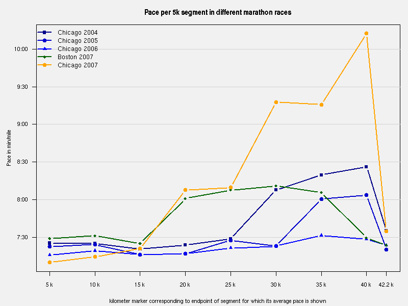
- The first marathon (dark blue squares) shows a marked slowdown after km 25.
- The following year (medium blue circles) a similar yet more moderate slowdown appeared 5 km later.
- The next year (blue triangles) the pace was remarkably stable without noticeable slowdowsn -- yielding the 'BQ' time.
- The Boston race (smaller green circles) was more prudent due to weather conditions, and a lingering cold, and I managed to finish much stronger than I ran the middle part.
- Chicago this year (orange circles) was a different story: too fast at the beginning, a cautious middle similar to the Boston race but two fairly significant slowdowns after 25 and 35 km, followed by some acceleration right before the finish.
While it was a tough race, I clearly ran a lot slower than previously, in particular between 25 km and 40 km. So there.