More on 'nicer charts'
Via the Planet Debian aggregator and his blog, Sven followed up on my post regarding Lucas' plot of the package age distribution.As some of my points didn't seem to make it across, I will reiterate them more plainly:
- GNUplot, while easy to use, creates charts that aren't terribly pretty;
- Lucas' original chart had, to paraphrase an expression by Tufte, a poor 'ink to paper ratio': the data is too concentrated in the last quartile;
- for that very reason, taking logs is a good thing here
Sven also addresses the fact that what we really want is to see the quantiles
of the data set. Quite right, and taking logs makes that easier. Consider
the two charts below which plot the 'package age in days' as an empirical
cumulative distribution function using built-in R functions ecdf
and plot.stepfun (rather than
redoing it ad-hoc as I had done), and also add explicitly quantiles. The two
charts use the exact same instructions; however the second chart transforms
the x-axis to a logarithmic scale.
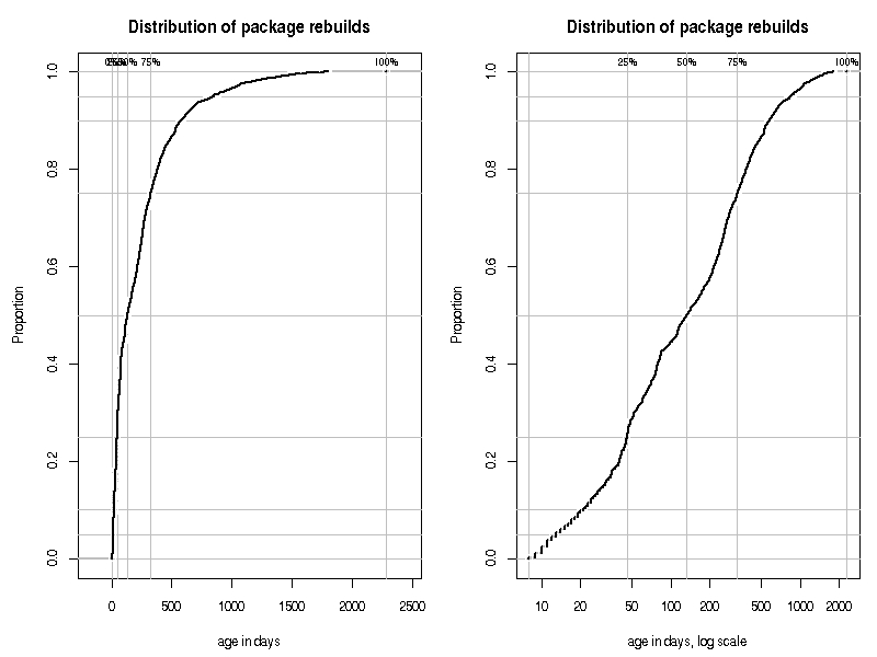
While it is close to impossible to find the 25 or 50 percentile on the first
chart, it becomes a lot easier on the second chart because the x-axis is
'stretched' using the log transform. About one quarters of the distribution appears
to be rebuild within 1.5 months old, and about half is younger than four
months (as a quick call to summary(pkgAge) confirms). Reading
these proprtions off the original chart, or the non-log chart, is much more difficult.