Plotting overbought / oversold regions in R
The good folks at Bespoke Investment Group frequently show charts of so-called overbought or oversold levels; see e.g. here for the most recent global markets snapshot.Classifying markets as overbought or oversold is a popular heuristic. It starts from computing a rolling smoothed estimate of the prices, usually via a (exponential or standard) moving average over a suitable number of days (where Bespoke uses 50 days, see here). This is typically coupled with a (simple) rolling standard deviation. Overbought and oversold regions are then constructed by taking the smoothed mean plus/minus one and two standard deviations.
Doing this is in R is pretty easy thanks to the combination of R's rich base functions and its add-on packages from CRAN. Below is a simply function I wrote a couple of months ago---and I figured I might as well release. It relies on the powerful packages quantmod and TTR by my pals Jeff Ryan and Josh Ulrich, respectively.
## plotOBOS -- displaying overbough/oversold as eg in Bespoke's plots
##
## Copyright (C) 2010 - 2011  Dirk Eddelbuettel
##
## This is free software: you can redistribute it and/or modify it
## under the terms of the GNU General Public License as published by
## the Free Software Foundation, either version 2 of the License, or
## (at your option) any later version.

suppressMessages(library(quantmod))     # for getSymbols(), brings in xts too
suppressMessages(library(TTR))          # for various moving averages

plotOBOS <- function(symbol, n=50, type=c("sma", "ema", "zlema"), years=1, blue=TRUE) {

    today <- Sys.Date()
    X <- getSymbols(symbol, src="yahoo", from=format(today-365*years-2*n), auto.assign=FALSE)
    x <- X[,6]                          # use Adjusted

    type <- match.arg(type)
    xd <- switch(type,                  # compute xd as the central location via selected MA smoother
                 sma = SMA(x,n),
                 ema = EMA(x,n),
                 zlema = ZLEMA(x,n))
    xv <- runSD(x, n)                   # compute xv as the rolling volatility

    strt <- paste(format(today-365*years), "::", sep="")
    x  <- x[strt]                       # subset plotting range using xts' nice functionality
    xd <- xd[strt]
    xv <- xv[strt]

    xyd <- xy.coords(.index(xd),xd[,1]) # xy coordinates for direct plot commands
    xyv <- xy.coords(.index(xv),xv[,1])

    n <- length(xyd$x)
    xx <- xyd$x[c(1,1:n,n:1)]           # for polygon(): from first point to last and back

    if (blue) {
        blues5 <- c("#EFF3FF", "#BDD7E7", "#6BAED6", "#3182BD", "#08519C") # cf brewer.pal(5, "Blues")
        fairlylight <- rgb(189/255, 215/255, 231/255, alpha=0.625) # aka blues5[2]
        verylight <- rgb(239/255, 243/255, 255/255, alpha=0.625) # aka blues5[1]
        dark <- rgb(8/255, 81/255, 156/255, alpha=0.625) # aka blues5[5]
    } else {
        fairlylight <- rgb(204/255, 204/255, 204/255, alpha=0.5)         # grays with alpha-blending at 50%
        verylight <- rgb(242/255, 242/255, 242/255, alpha=0.5)
        dark <- 'black'
    }

    plot(x, ylim=range(range(xd+2*xv, xd-2*xv, na.rm=TRUE)), main=symbol, col=fairlylight) 		# basic xts plot
    polygon(x=xx, y=c(xyd$y[1]+xyv$y[1], xyd$y+2*xyv$y, rev(xyd$y+xyv$y)), border=NA, col=fairlylight) 	# upper
    polygon(x=xx, y=c(xyd$y[1]-1*xyv$y[1], xyd$y+1*xyv$y, rev(xyd$y-1*xyv$y)), border=NA, col=verylight)# center
    polygon(x=xx, y=c(xyd$y[1]-xyv$y[1], xyd$y-2*xyv$y, rev(xyd$y-xyv$y)), border=NA, col=fairlylight) 	# lower
    lines(xd, lwd=2, col=fairlylight)   # central smooted location
    lines(x, lwd=3, col=dark)           # actual price, thicker
    invisible(NULL)
}
After downloading data and computing the rolling smoothed mean and standard deviation, it really is just a matter of plotting (appropriate) filled polygons. Here I used colors from the neat RColorBrewer package with some alpha blending. Colors can be turned off via an option to the function; ranges, data length and type of smoother can also be picked.
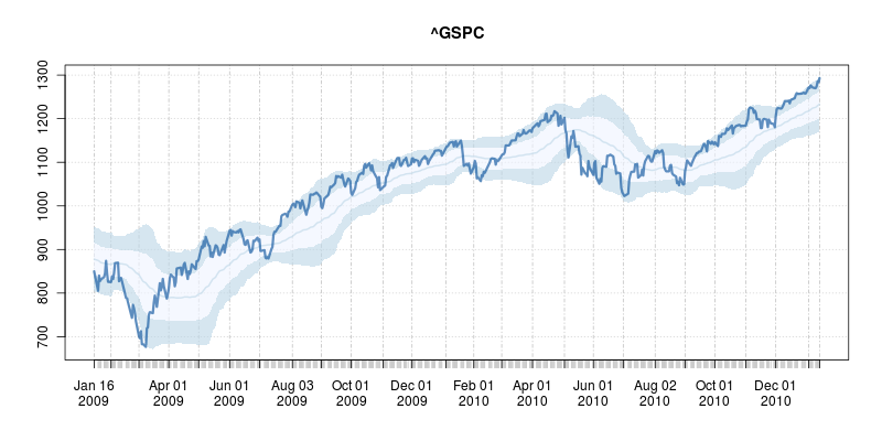
To call this in R, simply source the file and the call, say, plotOBOS("^GSPC", years=2)
which creates a two-year plot of the SP500 as shown here:

This shows the market did indeed bounce off the oversold lows nicely on a few occassions in 2009 and 2010 --- but also continued to slide after hitting the condition. Nothing is foolproof, and certainly nothing as simple as this is, so buyer beware. But it may prove useful in conjunction with other tools.
The code for the script is here and of course available under GPL 2 or later. I'd be happy to help incorporate it into some other finance package. Lastly, if you read this post this far, also consider our R / Finance conference coming at the end of April.
Edit: Corrected several typos with thanks to Josh.